When it comes to web design, people will judge a book by its cover. Your company will be judged by the quality of its design. First-time perceptions of your business will directly correlate with your web presence, functionality and aesthetics. This alone can make-or-break your conversions.

If you’re not sure whether your design is hurting or helping you, it will do you some good to look at it through a fresh, un-tinted lens. This is especially necessary if you’ve had the same design for years. It’s time for an honest assessment of your web design, and this post will help to walk you through it.
The layout of your website is absolutely crucial if you expect people to stay on your period of time. The website layout is first thing we’re going to talk about because it is one of the most important elements that goes into creating a great, functional design.
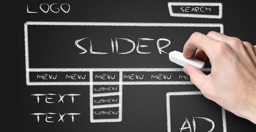
Map your layout
You might need to map it out. If you or your webmaster is designing your web site from the ground up (i.e without any preexisting themes or templates), then you may need to sketch out how your website is going to look. Many designers use wireframes—blueprints that will essentially map out how the site is going to look and function—before the new site is published on the web. This’ll act as a first draft for your website, and will give you the best chance to work out any problems with the design.
Keep the navigation easy to understand
Navigation is important. The navigation should facilitate the movement of your website. If someone is visiting your site, the process should be fluid—meaning that they find out what they need to know quickly and easily. Bad navigation is a near-guarantee that your visitors will get frustrated and not stay on your site. The good thing is that bad navigation is easy to identify and simple to fix.
Is your navigation in the right place? The navigation bar and links are usually near the top of the page, close to the logo. In some cases, you can find some navigation links in the footer (in addition to it being on the top of the page). Keep it in those in those common areas. The navigation is not where you should buck the trend (very rarely is it a good idea to keep the main navigation for the sidebar area or in the middle of the page).
Is your navigation consistent? Your navigation links need to be in the same order across all of your web pages.
Is the navigation simple? The amount links in your navigation should be kept to a minimum. But if you need additional links, use dropdown menus. You can also use other areas of the website (like the sidebar and footer areas).
Designing the content area
The content area needs to be readable. Use headings and subheadings to break up and highlight specific content areas on your website.
Use white space. Remember those websites from the 90’s to the early 2000’s? When every inch of the website was inundated with text, links, images? That’s not a good practice. And though it’s not a common in 2014 as it used to be, some designers still make the mistake of putting too many elements on the web page. White space (designated areas on the page that are vacant and free of any elements like text, images, etc) can be used to offset any clutter that can be found on the page. Aesthetically, it can give the website a more balanced appearance. Functionally, it can serve to highlight certain content areas on the website and makes things easier for the end user to understand. If there is just too much going on, use white space to silence the noise.
The layout should work across all platforms. We have talked in depth about responsive design, and it is worth mentioning here. Responsive design will ensure that your site will be readable across all devices—desktops, tablets, and smartphones. As mobile usage continues to rise, responsive design becomes more imperative.
The layout should be designed for the end user in mind. The topic of user experience is worthy of its own blog post, but we’ll talk about it here. If you’re a florist with a website, you have to think about what your customers are looking for when they are trying to buy flowers.
If, for example, they want to buy flowers with quickly and without a hassle, do not overwhelm them with too many elements on the page or too much information. Don’t design the site the way you’d like it; design it for them and their desires and needs.
Don’t design in a vacuum. This means having a detailed understanding of your demographics and delivering what they want to see. Don’t design for your tastes and preferences; build your site from the perspective of someone who will visit your site.
Following these tips can improve the aesthetics of your site, increase its performance, and can boost your conversions.
Very good advice, try to follow it. I think we are easy to use. Will keep a close eye on the site, thanks .
Toni atdweddingandeventflowers.com