Last week, for the first time, the Pantone Color Institute announced two shades as the color of the year for 2016: Rose Quartz and Serenity.
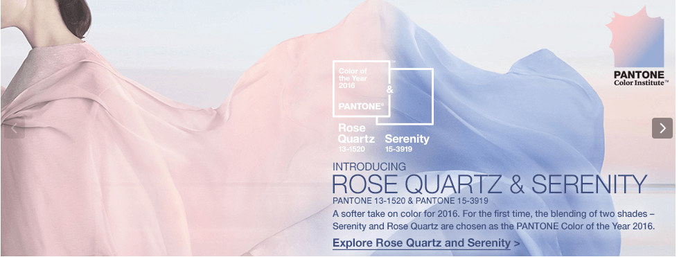
The pair of colors, a pale pink and baby blue, naturally conjures images of a gender reveal party or a baby shower, but Pantone executives maintain that was not the inspiration. “Rose quartz is not baby pink,” Leatrice Eiseman, Pantone’s executive director, told the Wall Street Journal. “It doesn’t have that wimpy feel.” Instead, the colors were chosen to convey rosy warmth and tranquility.
The decision has elicited mixed results from florists.
“Two colors SO WEAK that they had to pair up to equal what had been accomplished with a single color in the past,” said BJ Dyer, AAF, AIFD, of Bouquets in Denver, who was in good company of naysayers.
“I feel like I just found out I had two flat tires,” said Barry Cowart, AIFD.
“A total letdown,” echoed Adrianna Duran-Leon, AIFD, of The Flower Company Albuquerque.
Others couldn’t be happier.
“How pretty and feminine are those?” said Sylvia Bird, AAF, AIFD, PFCI. “They will go well with lilacs, purples and greys, which still seem to be the colors that brides love.”
Tom Sebenius, of The Arrangement Floral Design and Events in New York City, is excited to see such “florist friendly” colors. He imagines he’ll use a lot of eryngium, tweedia, scabiosa and nigella this spring. “Scabiosa is off the charts popular in the New York flower market,” he said. “Luckily it comes in shades similar to both Rose Quartz and Serenity.”
The pastel choices don’t really surprise him. “We’ve seen an abundance of watercolor prints for backdrops, linens and stationary for the past year and I think the idea of having two shades as colors of the year definitely plays into this,” he said.
His one concern is that the colors in combination do often evoke a baby shower. “It’s important to keep the flowers very sophisticated and elegant to combat this,” he said.
“This is the buzz right now: Why two colors? Pastels? For the holidays? Yikes! Is there reasoning?” said Ardith Beveridge, AAF, AIFD, PFCI, CAFA, director of education at Koehler & Dramm’s Institute of Floristry in Minneapolis.
The colors challenge the industry’s pattern, she explained.
“We’re used to red, green, white and blue in winter, pastels in spring, graduating to bright colors for summer and moving to rusts, golds and deep oranges for autumn,” she said. Using pastels year-round “shakes us up and that is ok.” She recalled 2013, when Pantone named Emerald color of the year. Some people thought it was strictly. Christmas-y, but designers knew how to make it work with spring and summer flowers and jewel tones for fall and winter.
Beveridge anticipates using Rose Quartz and Serenity with jewel tones, whites, champagnes and “greige.” “There are so many lovely pink flowers, so this will be fun to experiment with textures and styles,” she said. “And blue is always popular in home décor and flowers.” Natural blue flowers, like thistle, will go with everything, she said: “Play it cool, mix with greens and lavender, or complement with oranges.”
“These colors are completely viable. They are indeed what is currently happening and will be happening in 2016,” said Kristine Kratt, AIFD, PFCI, of Schaffer Designs in Philadelphia, who helped create the 2016 Flower Trends Forecast for the International Floral Distributors, Inc., after hundreds of hours of research and multiple trips around the globe.
“The unique thing here is the selection of 2 colors at once, and the fact that they are contrasting pastels,” she said. “Those who watched the Pantone video presentation of the trend release will clearly see that Serenity and Rose Quartz were selected because people are being drawn toward soft, tranquil colors in a time where we are in need of soothing.”
“It is logical. It is practical. It is not a surprise.”
The push for “soft and ethereal” colors is very clear if you look at runway fashions, home décor, and wedding trends, she said.
She reminds florists who don’t care for the selection that Pantone’s colors exist to offer designers guidelines and insights.
“There are no hard and fast rules in how you use them,” she said. “Don’t like pink and blue together? Combine them with other colors you deem fit.”
And be prepared for all the soon-to-be-engaged girls dying to have a “Rose Quartz wedding,” Kratt said. “Our job is to know about this look, sell the right designs accordingly, and be profitable.”