Mobile sales have usurped desktop sales. This tells us two things:
1) That the mobile trend is now an unstoppable force; mobile sales are likely to dominate technology for the foreseeable future.
2) People are now more comfortable on their mobile devices than on their desktops and laptops.
Ignoring these facts is like knowing a destructive category 5 hurricane is coming to your town, but you refuse to evacuate.
Needless to say, if you aren’t opening up mobile marketing channels, you are nuts; what we today call “online marketing” will be dominated by mobile channels and funnels for at least the next 5-15 years.
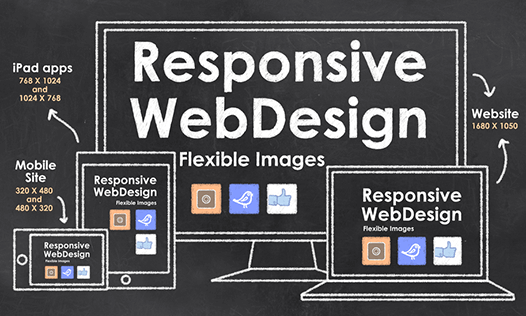
The urgency for mobile-compatible website design is apparent. Designers know this. There have been debates on the best way to make a website mobile-friendly—either with a separate mobile site or an all-encompassing responsive design. For a few years, mobile sites held popularity, but lately the opinion has swayed over to responsive design.
The reason: even though mobile sites do have their place, responsive design is the future. Let’s look at the benefits.
It offers simplicity
One of the major differences between a mobile sites and responsive design is the way domains are handled. With a regular mobile website a visitor will have to be redirected. With responsive design, there is only one url and the same HTML is used.
Google prefers this. It’s easier for Google to crawl and organize your content. And there will be less hurdles for you to jump over, as you won’t have to find and place redirect codes throughout your website.
You can also keep the keep SEO campaign without having to create a new one for your mobile site. Mobile SEO campaigns can be effective, but you’re opening up a whole new can of worms if you don’t have the budget or don’t know how it differs from regular SEO.
It offers flexibility
It doesn’t matter if you’re on an iPhone or a laptop, your site’s dimensions will expand or condense to fit within the parameters of any device’s screen. This functionality is built into the code of your site, so it will happen automatically. A mobile site, however, may or may not fit the dimensions of your mobile device as effectively.
Responsive design is also evergreen. The code is designed to fit the screen of any new device on the market. With a mobile site, you will have to make modifications to ensure that the site fits the screen dimensions of any new device that has been released. This high maintenance is inefficient, due to the sheer amount of new phones that get released each year. You’ll fall behind.
And most importantly, a responsive design has great content delivery. With a mobile site, you may not be able to keep the same content that you would normally have on your desktop site, because there may not be enough space, or it won’t fit the design aesthetic. Though mobile sites offer a good user experience on mobile devices (as they can be faster than responsive sites),it’s good to be able to view the same content that you would on a desktop site. Mobile sites are faster because they are bare: they require less bandwidth, but they use far less images and your content delivery is scaled down considerably.
It offers image and brand consistency
Imagine you have a potential customer that is searching for the best flowers to buy his spouse for their wedding anniversary. He’s sitting in a coffee shop, his laptop isn’t near him, and doesn’t want to purchase the flowers with his smartphone. When he goes home, he’ll enter the same url, and will be taken to the same website, with the same design and content, and will make the purchase. Responsive design helps build familiarity and consistency across all devices.
Responsive will produce a consistent image for your business. It can be a bit jarring to be on a separate mobile site, which has a simplistic interface and user experience, and then go to the more complex desktop site that has fully fleshed-out design.
In conclusion
Mobile websites can be less expensive and faster (bandwidth and reduced content), but they don’t offer the best options. In terms of flexibility, maintenance and aesthetics, responsive design wins out.
Mobile sales are skyrocketing and will continue to do so. That makes it imperative that you provide the most developed mobile experience to your visitors and to your customers. Responsive design answers the call.